
Inverter Monitor
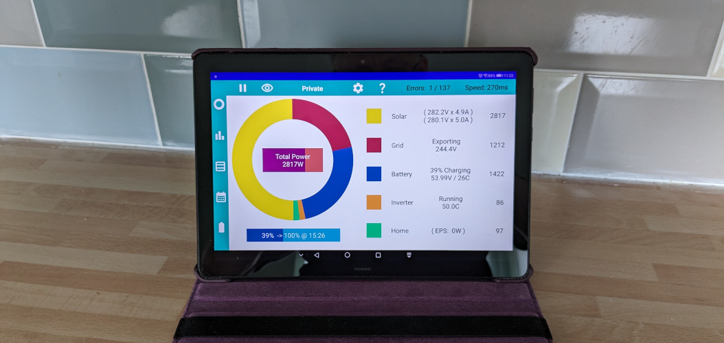

Once you turn on the collect stats option, an extra menu bar appears. Along the bottom of the screen in portrait mode, or up the side in landscape mode.
The top (or leftmost) icon takes you (back) to the main screen.
The next icon displays a minute-by-minute graphical analysis.
The next icon shows a minute-by-minute table of raw data.
The next (calendar) icon shows daily data in various formats.
The next icon gives access to the Controls and replaces the floating icon.
The next icon shows detailed battery information same as can be accessed by tapping the battery bar.
The final icon gives access to a Fault Log for when thing go wrong.
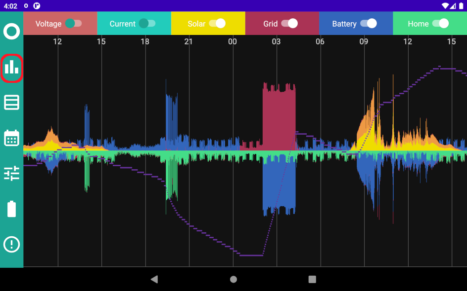
This really useful image tells you what has been going on with your system for the past 5000 minutes (just over 3 days). Scroll right and left to see further back over the time period.
The first thing to look for is any gaps in the data. These indicate when data hasn't been collected and could indicate a network communication problem.
Incoming power is always above the centre line, and outgoing power is below. With the default settings shown, if everything is working correctly, the image should look symmetrical.
The image is automatically scaled to fit the largest power value, if it doesn't appear to fill the screen, scroll right and left and you will find when the peak power occurred.
The toggles at the top of the image allow you to turn off selected parts of the image; turning off home and grid can help to see battery activity more clearly.
The Voltage and Current toggles add extra sections at the bottom of the graph. The Voltage scales are as follows: Solar 0V to 440V, Grid 207V to 253V, and Battery 46V to 56V (or 276V to 336V for AIO and HV). Current scale is 13A for Solar, and 80A for grid and battery.
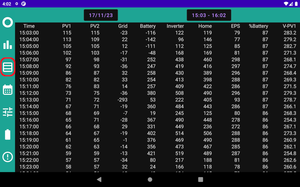
Everyone is different, some like a picture, whilst others prefer the precision offered by a table of numbers.
Here is a table of the minute-by-minute data. It can be scrolled up, down, left, and right. One one hour is shown at a time, choose the day and hour from the dropdowns at the top to zoom in on the precise data you need.
The first 7 columns show the various powers in Watts, followed by the estimated percentage level of the battery, then the five voltages in Volts, and finally the five corresponding currents in Amps.
A brief pause. Can you explain the difference between Power and Energy? If you can, then skip ahead to the next section.
Sometimes people are confused by the terms Power and Energy. Power comes from the power station, but you pay for it on your Energy bill. What's going on and what's the difference.
The difference is TIME. It is the same difference as Speed and Distance. Maybe you heard the joke "Excuse me sir, did you know you were going 80 miles per hour? That's impossible Officer, I'm only going 40 miles."
Power is like speed, it refers to what is happening right now or at a specific moment in time. Power is measured in kilowatts(kW).
Energy is like distance, it refers to what has happened over a period of time. Energy is measured in kilowatt-hours(kWh).
The previous sections were about Power; the next section is about Energy.
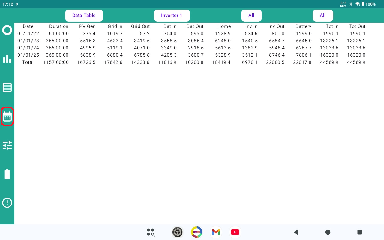
When you select the calendar icon, day by day energy data is displayed for the current month, with totals at the bottom.
PV Gen lets you easily confirm how much your system generated over the period. Grid In and Grid Out should align roughly with the utility bill from your energy supplier. The difference between Bat In and Bat Out over time is a good estimate of the energy lost as heat by your system as it works. On a day-by-day basis, this isn't a good measure unless the battery ends at the same level each day.
Three or four dropdowns at the top are used to customise the display. The first can be used to change the table for a bar chart. Other options on the first dropdown are explained on the Portal Transfer page.
The second dropdown only appears if there is more than one serial number recorded in the data. This might be because you have two inverters, or it might be because the inverter has been replaced. Whichever, you can select just one of the inverters, or see the combined results.
The last two dropdowns select the month and year. In each case "All" can be selected to see all data for a year, or the totals for all years as shown here.
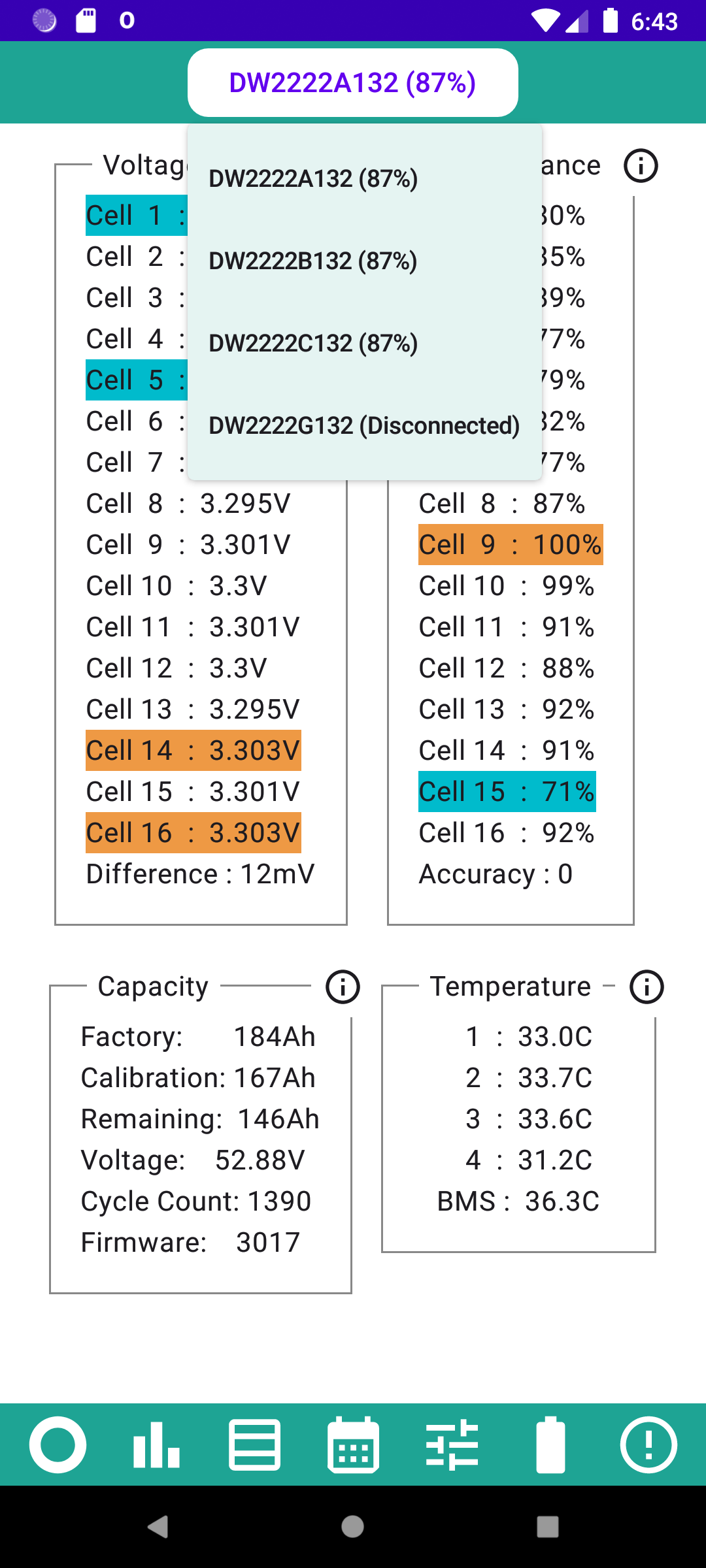
If you have more than one battery, you can select each one using the dropdown list at the top. Any batteries that are turned off or disconnected but have had performance statistics collected will show as disconnected. If a battery has been permanently disconnected, there will be an option to delete the data.
The cell voltage readings are as of right now (although they only update every few minutes). The highest are highlighted in orange and the lowest highlighted in blue. The readings are +/- 5mV so a difference less than 10mV can be regarded as zero. The normal cell voltage range is between 3V and 3.4V and the voltages should be similar, a difference of more than 50mV would be concerning at normal voltages. When the battery is very low or nearing full, the difference will increase, and 200mV is not uncommon.
During each charge/discharge cycle, the app monitors how the cell voltages change, and uses this to determine a performance score. The scores for each cycle are merged into an exponentially smoothed moving average, and then converted to a percentage whereby the best performing cell is awarded 100% and the others get a relative percentage. Provided the data passes validation checks, the accuracy goes up by one each cycle when the latest results get merged into the average. The accuracy can go down if the validation checks fail or if data is not collected for a period of time.
There will always be one cell at 100%. Accuracy takes many days to build and goes up to 50. If over time the percentage reported for a cell goes up, it does not mean the cell has improved, more likely other cells have deteriorated.
In the capacity box, the factory capacity (only shown if available on your system) is set at the factory and should never change. The calibration capacity is the capacity determined at the last calibration. Some firmware versions can adjust this dynamically so regular calibration is no longer necessary. The remaining capacity is an estimate and used to calculate the percentage by diving by the calibration capacity.
Voltage is measured at the BMS and not the battery output terminals. When multiple batteries are connected together, it is very important that they are at similar voltages (within 0.5V)
In a gen1 battery there are 5 temperature sensors, one monitors the temperature of the BMS circuit board. The battery cells are arranged into 4 banks of 4 cells, and it is believed that there is a temperature sensor in each bank of cells. An AIO battery pack has 24 cells and there are 12 temperature sensors, presumably packed between alternate cells.
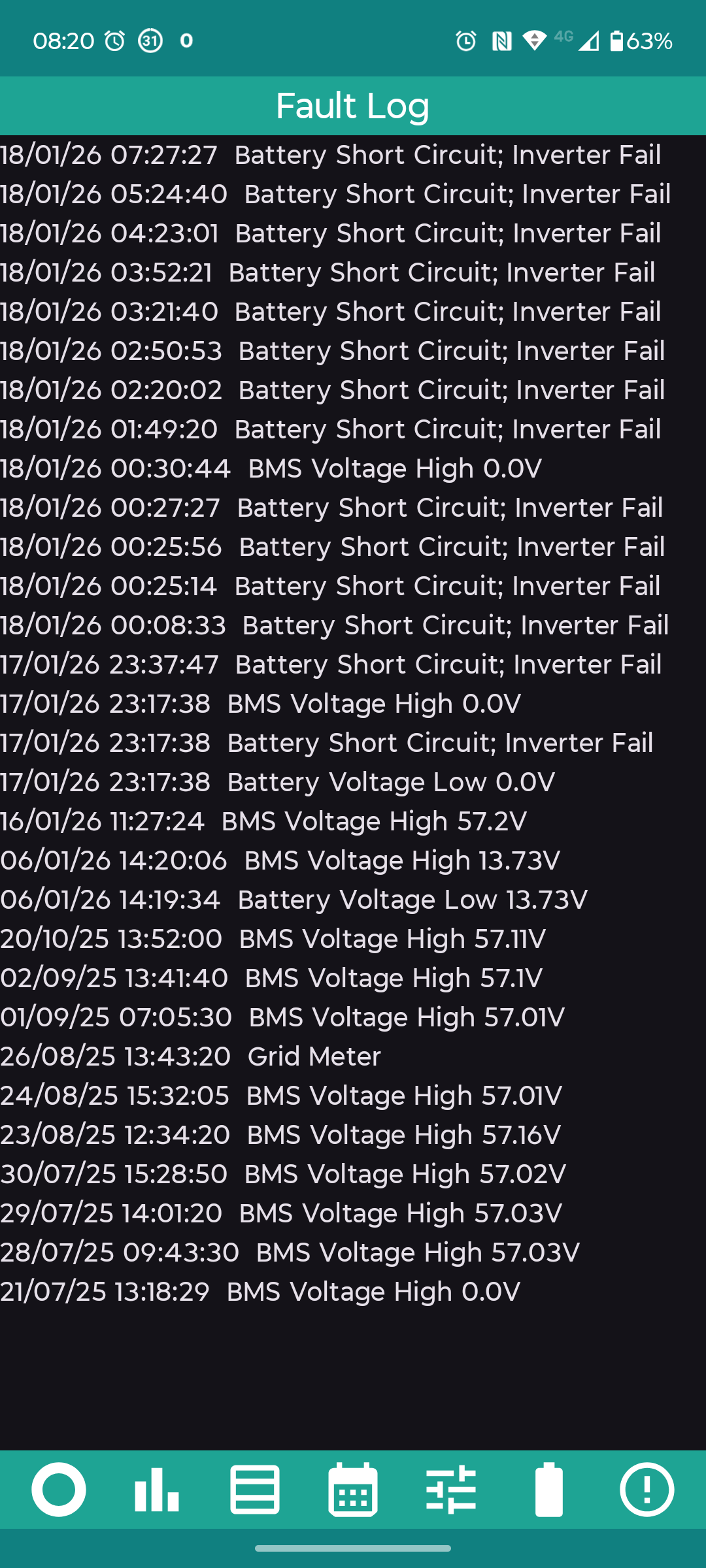
It is well worth checking the fault log from time to time. The log only holds the last 100 messages, so even when the system is working well, messages can be lost after a few months. Occasional messages such as Grid Meter, and BMS Voltage can be ignored, provided they are not happening on a near daily basis.
On some battery firmwares, frequent BMS Voltage messages are an indication that the battery needs recalibrating.
If you have more than one system connected to the app, each message in the log will be preceded by the serial number of the system to which it relates.
The fault log really becomes valuable when the system fails. The messages indicate to an experienced repairer what has happened and what needs to be done to repair the system.
In the example log shown, at 23:17:38 on 17th January 2026, a component on the battery control board failed. The owner was fortunate that this was one of the last systems replaced by GivEnergy under warranty. Repair of this fault costs in the region of £400.